AI Studio • Reporting Dashboards

If your leadership team is still reading last Friday's spreadsheet, you are already making this week's decisions late.

Most growing businesses do not have a data problem. They have a visibility problem. The numbers exist. They sit inside a CRM, an ad platform, a payment processor, a delivery tracker, a support tool, and two versions of a spreadsheet nobody fully trusts. On Monday morning someone stitches a version of the truth together in time for the leadership meeting. By Wednesday it is stale. By Friday it is wrong. Reporting dashboards replace that cycle with a live layer that pulls from every source, shows the metrics that drive your decisions, and updates on its own. One dashboard for finance. One for marketing. One for sales. One for operations. The same numbers, available to everyone who needs them, all the time.
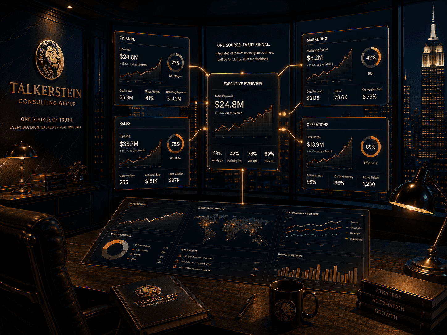
A visual data map by Talkerstein Consulting Group showcasing four specialized reporting blocks—Finance, Sales, Marketing, and Operations—funneling live data via glowing orange connection lines into a centralized 'Executive Overview' dashboard module, set against a dark city skyline backdrop.

Your reports are not wrong because your team is careless. They are wrong by design.

A weekly spreadsheet report depends on a human remembering every step, connecting every source, and interpreting every ambiguity the same way every time. That works when the business is small. It quietly stops working the moment there is more than one team, more than one platform, and more than one definition of a key term. Two people report to leadership on the same metric and get different numbers. A campaign looks profitable in one view and unprofitable in another. Someone catches the mistake, someone else blames the data, and the meeting ends with a commitment to clean the numbers for next week. What you actually need is not a cleaner spreadsheet. You need an infrastructure layer that makes the reports produce themselves. That is what a proper dashboard stack is.
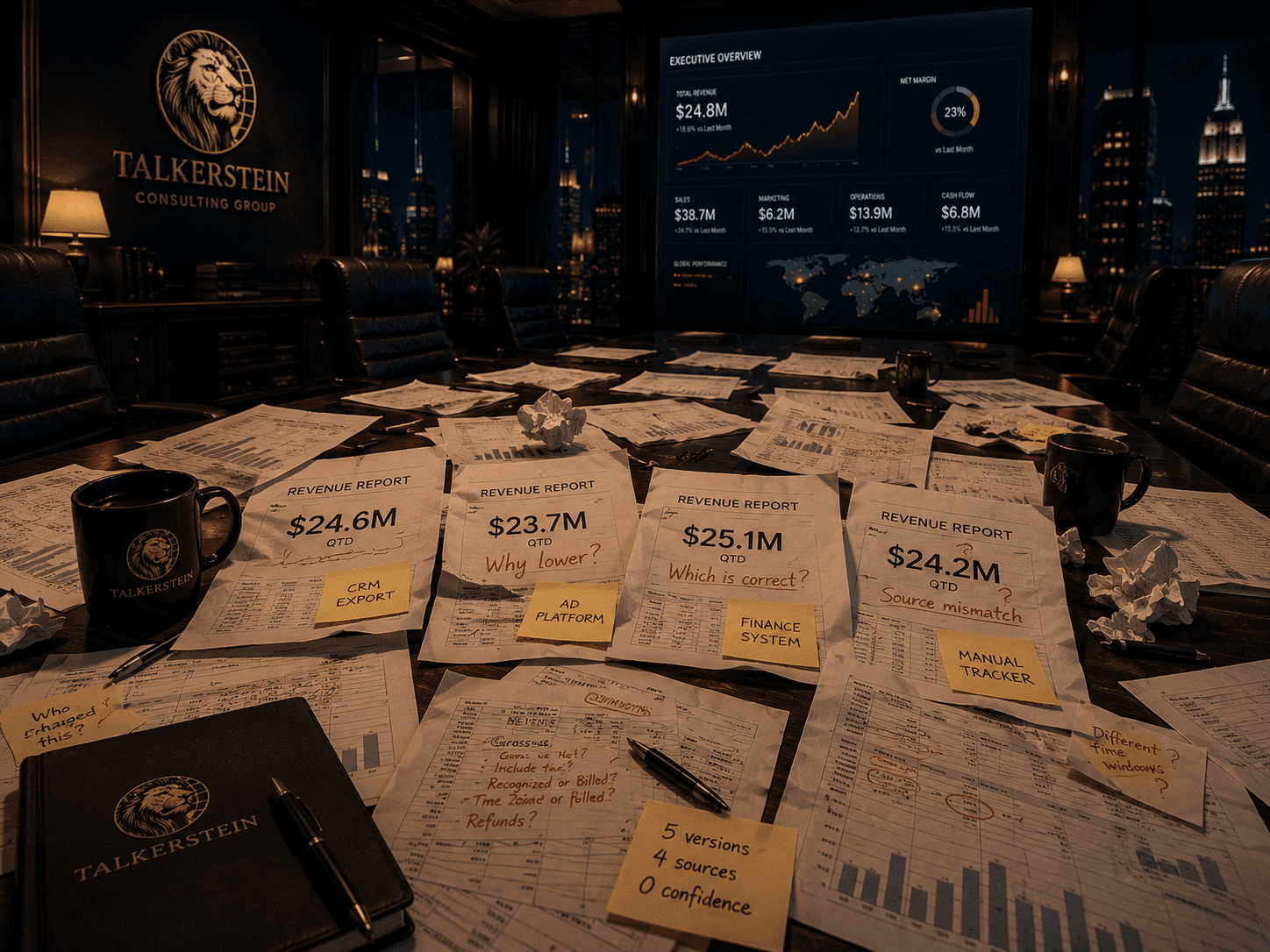
A boardroom table covered in disorganized, conflicting revenue reports with handwritten red ink questions like 'Why lower?', 'Which is correct?', and 'Source mismatch?'. Yellow sticky notes read 'CRM Export' and 'Manual Tracker,' contrasting sharply with a clean Talkerstein Consulting Group digital dashboard on the wall behind it.

What invisible data quietly costs

The business is making every decision with a fog of war over half the map.
  1. Labour cost

Senior operators and analysts spending hours a week assembling reports that could be generated automatically. The most expensive people in your business doing the lowest value task.

  1. Alignment cost

Two teams citing two numbers for the same metric in the same meeting. The real cost is not the disagreement. It is the trust that erodes every time it happens.

  1. Latency cost

Decisions made on numbers that are three to seven days old. By the time the trend is visible in a weekly report, the window to act on it has already closed.

  1. Blind spot cost

Metrics that should be watched are not being watched because nobody has the time to build the report. Churn edges up for a quarter before anyone sees it.

  1. Labour cost

Senior operators and analysts spending hours a week assembling reports that could be generated automatically. The most expensive people in your business doing the lowest value task.

  1. Alignment cost

Two teams citing two numbers for the same metric in the same meeting. The real cost is not the disagreement. It is the trust that erodes every time it happens.

  1. Latency cost

Decisions made on numbers that are three to seven days old. By the time the trend is visible in a weekly report, the window to act on it has already closed.

  1. Blind spot cost

Metrics that should be watched are not being watched because nobody has the time to build the report. Churn edges up for a quarter before anyone sees it.

  1. Labour cost

Senior operators and analysts spending hours a week assembling reports that could be generated automatically. The most expensive people in your business doing the lowest value task.

  1. Latency cost

Decisions made on numbers that are three to seven days old. By the time the trend is visible in a weekly report, the window to act on it has already closed.

  1. Alignment cost

Two teams citing two numbers for the same metric in the same meeting. The real cost is not the disagreement. It is the trust that erodes every time it happens.

  1. Blind spot cost

Metrics that should be watched are not being watched because nobody has the time to build the report. Churn edges up for a quarter before anyone sees it.

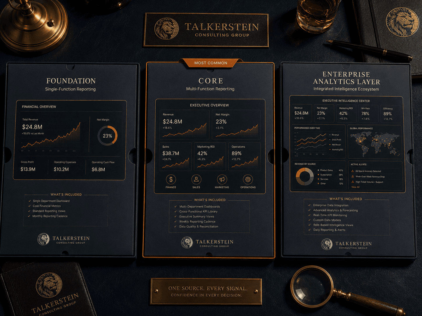
A top-down view of a luxury desk displaying three service tiers from Talkerstein Consulting Group: 'Foundation' for single-function reporting, 'Core' for multi-function reporting labeled as most common, and 'Enterprise Analytics Layer' for an integrated intelligence ecosystem. Talkerstein branded notebooks and a magnifying glass surround the portfolios.

Live dashboards, built around your decisions, not around the tools they come from.

We build dashboards the way we build any serious piece of operating infrastructure. We start with the decisions the dashboard is supposed to support. We work backwards from those decisions to the metrics, from the metrics to the definitions, and from the definitions to the source systems. Only then do we build. The deliverable is not a pretty chart. It is a decision layer that your leadership team can actually run the business on.
G1

Essential Dashboard

One core dashboard for one team. Clear KPIs, live data, working filters. Right for a first step into live reporting where the leadership team needs a single source of truth for one function: requirements session and metric definition, integration with two or three data sources, eight to twelve core KPI visualisations, hourly auto-refresh, one custom filter or drill-down path, threshold alerts into email or Slack, light training and a written runbook.

I'm Interested

G2

Multi-Team Dashboard Suite

Most Common

Three to five connected dashboards across sales, marketing, operations, and finance. Shared definitions, role-based views. Right for leadership teams that need the same numbers across every department meeting: metric architecture, integration with four to six data sources, thirty to fifty visualisations, real-time or hourly refresh, team-specific views and permissions, custom calculated metrics, anomaly detection, scheduled digests, quarterly tune-up.

I'm Interested

G3

Enterprise Analytics Layer

Unlimited dashboards, data warehouse or lake integration, predictive metrics, and embedded analytics. Right for multi-brand, multi-region, or private-equity backed businesses where the reporting layer is a board-level concern: everything in Core, data warehouse build or integration, advanced modelling, cohort and predictive metrics, custom applications and embedded analytics, API access, governance and audit trail, dedicated analytics partner.

I'm Interested

G1

Essential Dashboard

One core dashboard for one team. Clear KPIs, live data, working filters. Right for a first step into live reporting where the leadership team needs a single source of truth for one function: requirements session and metric definition, integration with two or three data sources, eight to twelve core KPI visualisations, hourly auto-refresh, one custom filter or drill-down path, threshold alerts into email or Slack, light training and a written runbook.

I'm Interested

G2

Multi-Team Dashboard Suite

Most Common

Three to five connected dashboards across sales, marketing, operations, and finance. Shared definitions, role-based views. Right for leadership teams that need the same numbers across every department meeting: metric architecture, integration with four to six data sources, thirty to fifty visualisations, real-time or hourly refresh, team-specific views and permissions, custom calculated metrics, anomaly detection, scheduled digests, quarterly tune-up.

I'm Interested

G3

Enterprise Analytics Layer

Unlimited dashboards, data warehouse or lake integration, predictive metrics, and embedded analytics. Right for multi-brand, multi-region, or private-equity backed businesses where the reporting layer is a board-level concern: everything in Core, data warehouse build or integration, advanced modelling, cohort and predictive metrics, custom applications and embedded analytics, API access, governance and audit trail, dedicated analytics partner.

I'm Interested

G1

Essential Dashboard

One core dashboard for one team. Clear KPIs, live data, working filters. Right for a first step into live reporting where the leadership team needs a single source of truth for one function: requirements session and metric definition, integration with two or three data sources, eight to twelve core KPI visualisations, hourly auto-refresh, one custom filter or drill-down path, threshold alerts into email or Slack, light training and a written runbook.

I'm Interested

G2

Multi-Team Dashboard Suite

Most Common

Three to five connected dashboards across sales, marketing, operations, and finance. Shared definitions, role-based views. Right for leadership teams that need the same numbers across every department meeting: metric architecture, integration with four to six data sources, thirty to fifty visualisations, real-time or hourly refresh, team-specific views and permissions, custom calculated metrics, anomaly detection, scheduled digests, quarterly tune-up.

I'm Interested

G3

Enterprise Analytics Layer

Unlimited dashboards, data warehouse or lake integration, predictive metrics, and embedded analytics. Right for multi-brand, multi-region, or private-equity backed businesses where the reporting layer is a board-level concern: everything in Core, data warehouse build or integration, advanced modelling, cohort and predictive metrics, custom applications and embedded analytics, API access, governance and audit trail, dedicated analytics partner.

I'm Interested

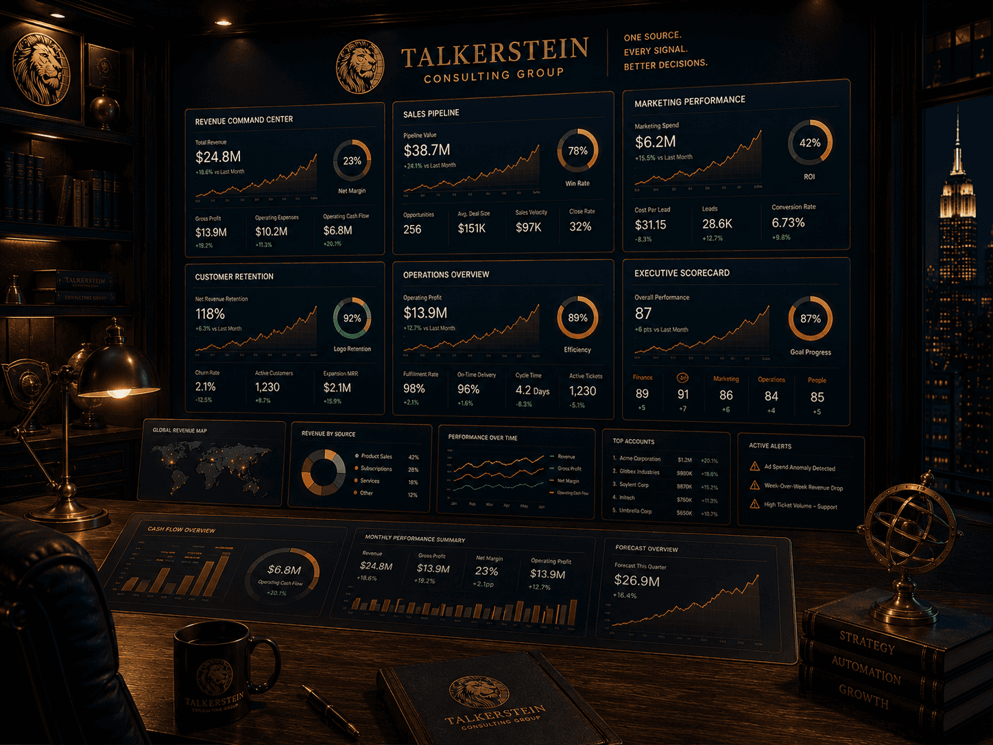
A massive multi-department digital command center display by Talkerstein Consulting Group set in an executive office at night. The dashboard displays tracking cards for a Revenue Command Center, Sales Pipeline, Marketing Performance, Customer Retention, Operations Overview, and an Executive Scorecard showing an 87 overall performance rating

The dashboards we end up building most often.

No two businesses need the exact same dashboards. That said, the views below are the ones we keep coming back to across service, SaaS, ecommerce, and multi-location operators. They are a starting palette. We build the ones that drive your decisions and skip the ones that do not.
Revenue and cash command centre

Real-time view of bookings, recognised revenue, collections, and cash position. The single screen a CEO or CFO opens before every leadership meeting.

Marketing and acquisition

Blended CAC, channel contribution, content velocity, and attribution clarity. The dashboard that settles the argument between marketing and finance.

Retention and churn

Net retention, logo churn, expansion rate, and early-warning signals on at-risk accounts. The metric most businesses discover they needed about a quarter too late.

Executive scorecard

The three to five numbers the CEO actually owns, in one view, with trend lines. Used directly in board or investor updates.

Pipeline and sales performance

Weighted pipeline, stage velocity, conversion by source, and rep load. The view that keeps your weekly sales meeting honest.

Client delivery health

Active projects, time-to-deliver, revision cycles, and margin by engagement. Essential for any services or agency business with a portfolio of live work.

Operations and capacity

Team utilisation, queue depth, SLA adherence, and bottleneck alerts. The view that keeps delivery from becoming a bottleneck to growth.

Revenue and cash command centre

Real-time view of bookings, recognised revenue, collections, and cash position. The single screen a CEO or CFO opens before every leadership meeting.

Marketing and acquisition

Blended CAC, channel contribution, content velocity, and attribution clarity. The dashboard that settles the argument between marketing and finance.

Retention and churn

Net retention, logo churn, expansion rate, and early-warning signals on at-risk accounts. The metric most businesses discover they needed about a quarter too late.

Executive scorecard

The three to five numbers the CEO actually owns, in one view, with trend lines. Used directly in board or investor updates.

Pipeline and sales performance

Weighted pipeline, stage velocity, conversion by source, and rep load. The view that keeps your weekly sales meeting honest.

Client delivery health

Active projects, time-to-deliver, revision cycles, and margin by engagement. Essential for any services or agency business with a portfolio of live work.

Operations and capacity

Team utilisation, queue depth, SLA adherence, and bottleneck alerts. The view that keeps delivery from becoming a bottleneck to growth.

Revenue and cash command centre

Real-time view of bookings, recognised revenue, collections, and cash position. The single screen a CEO or CFO opens before every leadership meeting.

Pipeline and sales performance

Weighted pipeline, stage velocity, conversion by source, and rep load. The view that keeps your weekly sales meeting honest.

Marketing and acquisition

Blended CAC, channel contribution, content velocity, and attribution clarity. The dashboard that settles the argument between marketing and finance.

Client delivery health

Active projects, time-to-deliver, revision cycles, and margin by engagement. Essential for any services or agency business with a portfolio of live work.

Retention and churn

Net retention, logo churn, expansion rate, and early-warning signals on at-risk accounts. The metric most businesses discover they needed about a quarter too late.

Operations and capacity

Team utilisation, queue depth, SLA adherence, and bottleneck alerts. The view that keeps delivery from becoming a bottleneck to growth.

Executive scorecard

The three to five numbers the CEO actually owns, in one view, with trend lines. Used directly in board or investor updates.

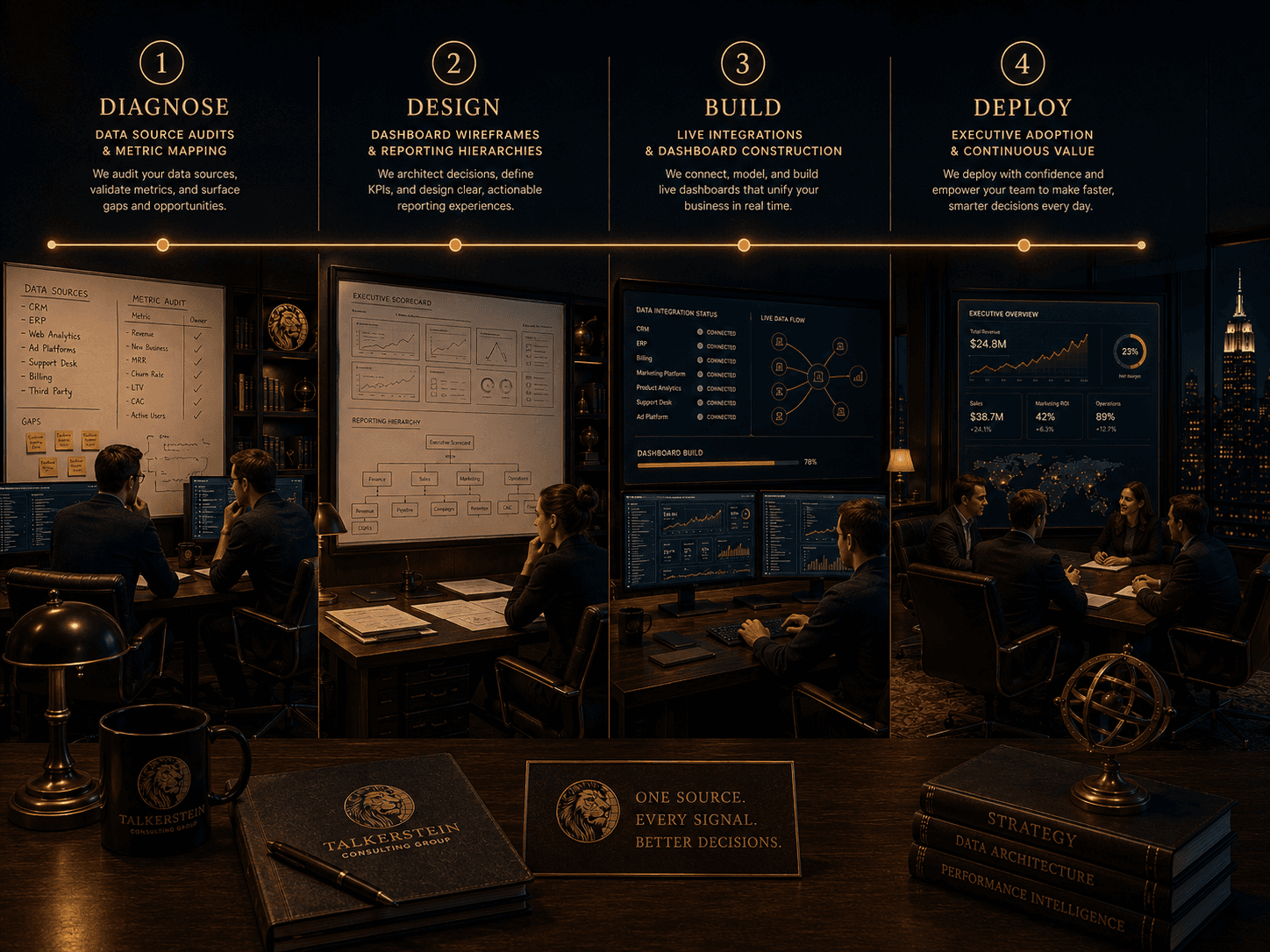
An infographic detailing the four-stage data infrastructure process by Talkerstein Consulting Group: 1) Diagnose (data audits), 2) Design (wireframes), 3) Build (live integrations), and 4) Deploy (executive adoption). Each phase is paired with a visual of consultants working in a high-end corporate office environment.

Four phases from scattered data to one source of truth.

01 Diagnose — We audit your data sources, talk to the people who will use the dashboards, and agree on exactly which decisions the reporting layer is going to support. If a metric does not connect to a decision, it does not belong on the dashboard.

02 Design — We draft every view on paper or in low-fidelity before touching a tool. You see the layout, the hierarchy, and the drill-down paths and sign off on them before we build. No surprises in the finished product.

03 Build — We wire the integrations, model the data, build the visualisations, and configure the alerts. Every metric is tested against a known period so that the numbers can be trusted on day one.

04 Deploy and calibrate — We train each team, monitor query performance, and iterate on the layouts for the first thirty to sixty days. After that the system runs. We can stay on for quarterly tune-ups or step away. Both are valid.
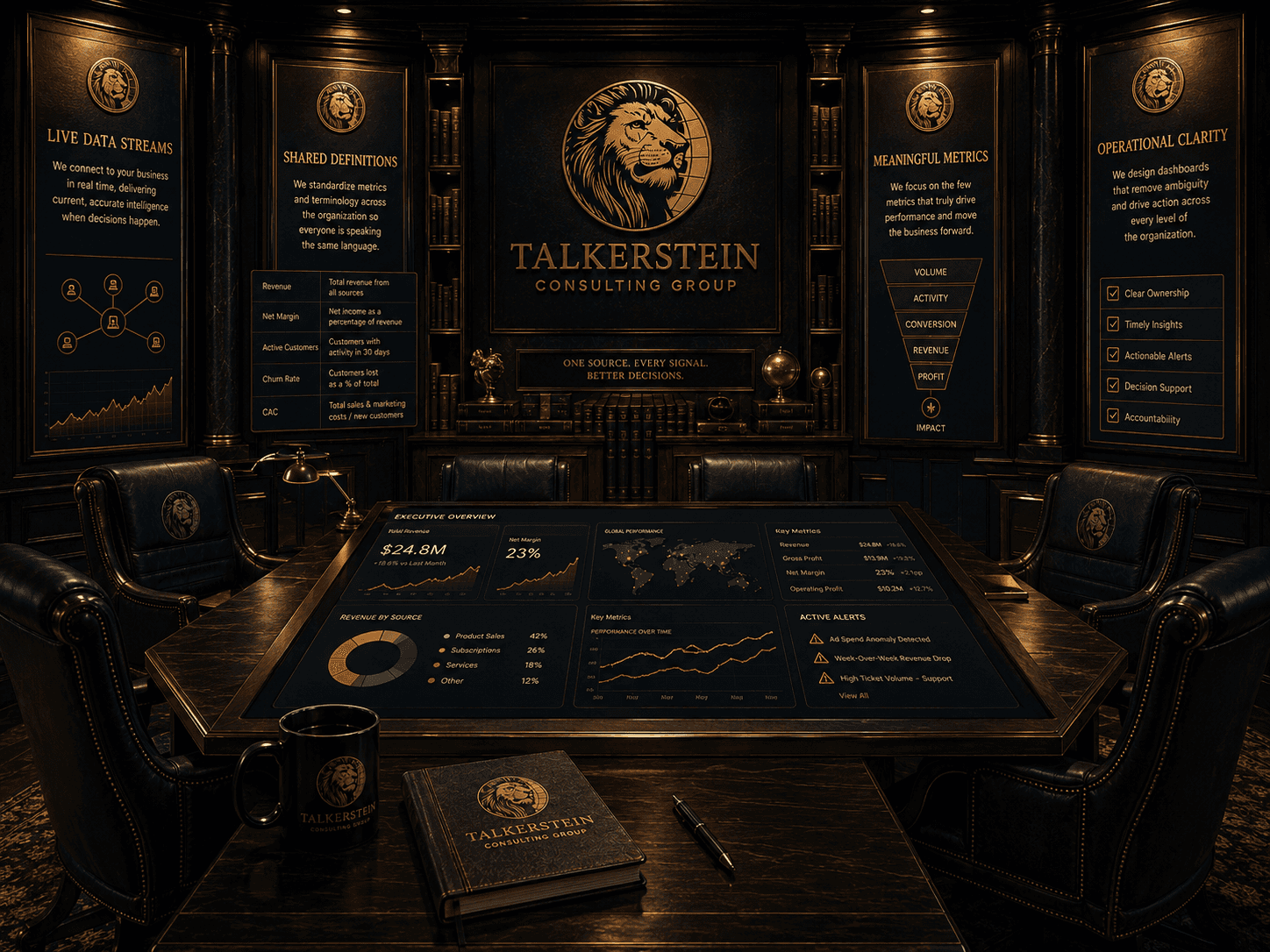
A luxury corporate boardroom featuring a large interactive digital table displaying an Executive Overview dashboard by Talkerstein Consulting Group. The walls feature wood-paneled digital plaques detailing 'Live Data Streams,' 'Shared Definitions,' 'Meaningful Metrics' via a conversion funnel, and 'Operational Clarity' checkmarks.

Four rules for dashboards that earn their place.
Live data, not weekly reports.

A dashboard refreshes on a schedule the decision can live with. Most refresh hourly. Anything slower than that is a report, and reports belong in a different conversation.

Metrics, not vanity.

If a chart does not change behaviour, it should not be on the dashboard. We put a deliberate cap on what each view holds so that attention stays on what matters.

One source of truth, or none at all.

Every team uses the same definition of the same metric, pulled from the same source. The moment two teams use two numbers for one metric, the dashboard has already failed.

Readable without a decoder ring.

Dashboards must be usable by operators and leaders, not only analysts. If a senior manager cannot explain a metric in one sentence, we rework the label and the chart.

Live data, not weekly reports.

A dashboard refreshes on a schedule the decision can live with. Most refresh hourly. Anything slower than that is a report, and reports belong in a different conversation.

Metrics, not vanity.

If a chart does not change behaviour, it should not be on the dashboard. We put a deliberate cap on what each view holds so that attention stays on what matters.

One source of truth, or none at all.

Every team uses the same definition of the same metric, pulled from the same source. The moment two teams use two numbers for one metric, the dashboard has already failed.

Readable without a decoder ring.

Dashboards must be usable by operators and leaders, not only analysts. If a senior manager cannot explain a metric in one sentence, we rework the label and the chart.

Live data, not weekly reports.

A dashboard refreshes on a schedule the decision can live with. Most refresh hourly. Anything slower than that is a report, and reports belong in a different conversation.

One source of truth, or none at all.

Every team uses the same definition of the same metric, pulled from the same source. The moment two teams use two numbers for one metric, the dashboard has already failed.

Metrics, not vanity.

If a chart does not change behaviour, it should not be on the dashboard. We put a deliberate cap on what each view holds so that attention stays on what matters.

Readable without a decoder ring.

Dashboards must be usable by operators and leaders, not only analysts. If a senior manager cannot explain a metric in one sentence, we rework the label and the chart.

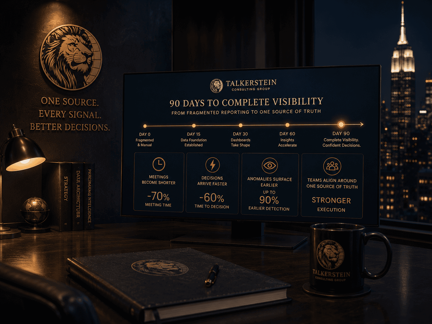
A digital display on a dark wood desk outlining Talkerstein Consulting Group's '90 Days to Complete Visibility' roadmap. The timeline progresses from Day 0 (Fragmented & Manual) to Day 90 (Complete Visibility). Below, metrics highlight achievements: -70% meeting time, -60% time to decision, and up to 90% earlier anomaly detection.

Meetings shorten. Arguments stop. Decisions arrive a week earlier.

The first visible change is usually the meeting. Weekly reviews that used to take forty minutes tighten to twenty, because the team is looking at the same live numbers instead of debating which version is right. The second change is the kind of question that gets asked. Teams stop asking 'what is the number' and start asking 'why is the number moving'. That shift is when the dashboard is earning its place. The third change arrives later. Decisions that used to follow trends start leading them.

Leadership walks into Monday with the same numbers the team is working from.
Anomalies surface in hours, not weeks.
Board and investor updates pull from the same system the business runs on.
Recurring weekly reports stop eating senior operator time.
Debates about data quality get replaced by debates about strategy.
Scaling the business does not require scaling the reporting team.
Leadership walks into Monday with the same numbers the team is working from.
Anomalies surface in hours, not weeks.
Board and investor updates pull from the same system the business runs on.
Recurring weekly reports stop eating senior operator time.
Debates about data quality get replaced by debates about strategy.
Scaling the business does not require scaling the reporting team.
Leadership walks into Monday with the same numbers the team is working from.
Recurring weekly reports stop eating senior operator time.
Anomalies surface in hours, not weeks.
Debates about data quality get replaced by debates about strategy.
Board and investor updates pull from the same system the business runs on.
Scaling the business does not require scaling the reporting team.
Four executives in a high-end boardroom reviewing printed reporting wireframes and a dark-mode data dashboard on a wooden conference table. In the background, a screen displays the Talkerstein Consulting Group logo with the slogan 'One Source. Every Signal. Better Decisions.' over a night view of the New York City skyline.

Is this the right step for you?

Work with us if
  • You are running a business with real data across several systems and no shared source of truth.

  • Your leadership team has at least one recurring meeting where numbers are a frequent point of friction.

  • You can name three to five decisions you would make better with live data.

  • You have senior operators spending hours a week assembling reports manually.

  • You are planning to raise, refinance, or brief a board in the next twelve months and the reporting layer needs to hold up under scrutiny.

Do not work with us if
  • You are pre-revenue or pre-process and do not yet have the data to report on. A dashboard build would be premature.

  • You need a one-time static report for a presentation. Better handled by a deck, not a live system.

  • You are not willing to commit to shared metric definitions across teams. No dashboard survives that.

  • You are looking for a free or near-free BI tool rather than a scoped build. We are not the right partner for that procurement.

What serious buyers usually ask.

Which dashboard platforms do you build on?

We work in Looker Studio, Power BI, Metabase, and custom builds inside the Retool or observable stack. For most Core-tier engagements, the right choice is the platform that your team will keep using after we leave. We are not wed to any one tool and we will tell you openly when a different platform would serve you better.

Can you pull from our existing CRM, ad platforms, and finance stack?

Yes. If a platform exposes an API, a data export, or a database connection, we can integrate it. That includes GHL, HubSpot, Salesforce, Stripe, QuickBooks, Xero, Shopify, Meta, Google Ads, LinkedIn Ads, Google Analytics, and most mid-market ops tools. Edge cases we flag in the diagnostic.

How often do dashboards refresh?

Most business dashboards refresh hourly, which is the right cadence for the decisions they support. Operations or customer-facing dashboards often refresh every one to five minutes. Real-time streaming is available on Custom engagements where the decision requires it.

Do we own the dashboards after you build them?

Yes. You own the dashboards, the data pipelines, the documentation, and the access. If you choose not to continue with us after go-live, the system keeps running. That is the test of whether the build was honest.

What if we add a new data source next quarter?

Expected. Core and Custom engagements include a quarterly tune-up where new sources, new metrics, or new views are folded in. For Foundation engagements we quote the addition as a small scoped extension, not a full re-engagement.

How do you handle metric disagreements between teams?

We run a shared definitions workshop in the Design phase. Sales, marketing, finance, and operations agree in the room on what each shared metric means and how it is calculated. That agreement becomes the documented source of truth. Without it, no dashboard will hold.

What about data security and permissions?

Role-based permissions are built into every Core and Custom build. Most mid-market clients end up with three to five access tiers. For regulated or enterprise engagements we layer in audit trails and approval workflows. Security is treated as a requirement, not a feature.

How involved does our team need to be?

Expect five to eight hours a week during build from the person who owns the reporting function, plus a one-hour definitions session with each team lead. Less than that and we risk shipping a dashboard that does not match how the business actually runs.

What budget range usually makes sense here?

Foundation is the smallest engagement and runs at the low end of the range. Core is the most common fit for a leadership team that wants one shared source of truth across departments, and lives in the mid five figures for the build plus an optional Care Plan if you want quarterly tune-ups. Custom is always scoped after a diagnostic.

What does a strong engagement usually turn into next?

Two patterns. One, the dashboard reveals a gap that Custom AI Agents or Automation can close, and we scope the next layer together. Two, the dashboard becomes the backbone of a recurring leadership rhythm, and a Care Plan keeps it tuned as the business grows. Neither is required. Both are common.

Our Services

What Our Partners Think

They are highly supportive! I feel completely supported in every part of my marketing. They are a wonderful team of people each bring in their own talents and strengths. They are responsive and eager to please and it's been a pleasure working with them.

Tova, Toronto

Co-owner of FRINGE boutique

What Our Partners Think

They are highly supportive! I feel completely supported in every part of my marketing. They are a wonderful team of people each bring in their own talents and strengths. They are responsive and eager to please and it's been a pleasure working with them.

Tova, Toronto

Co-owner of FRINGE boutique

Let's Work Together

What Our Partners Think

They are highly supportive! I feel completely supported in every part of my marketing. They are a wonderful team of people each bring in their own talents and strengths. They are responsive and eager to please and it's been a pleasure working with them.

Tova, Toronto

Co-owner of FRINGE boutique

What Our Partners Think

They are highly supportive! I feel completely supported in every part of my marketing. They are a wonderful team of people each bring in their own talents and strengths. They are responsive and eager to please and it's been a pleasure working with them.

Tova, Toronto

Co-owner of FRINGE boutique

Let's Work Together